
Rescuing and rebuilding the Rest Super design system
A solo audit, consolidation, and documentation project that turned an undocumented, siloed Figma system into a structured, maintainable foundation for both web and native mobile.

The situation
Rest Super had a design system in name only. In practice, what existed was a collection of Figma files maintained by two designers working largely in parallel, one owning web, one owning native mobile with no shared rules, no documentation, and no common structure connecting the two. The system lived entirely in the heads of those two designers. That worked until it didn't.
The problems this created were predictable but significant. Components had been built differently across web and mobile, with overlapping patterns that diverged in ways nobody had formally tracked. In many instances what was designed was not always what was built. Design debt had accumulated quietly over time. New contributors had no way to understand how the system worked or how to add to it without introducing more inconsistency. And with all that knowledge undocumented, the whole thing was one departure away from becoming unworkable.
This wasn't a Greenfield build it was a recovery operation. The challenge wasn't just cleaning up what existed, it was doing it without breaking the work of two designers who had built their own ways of working around a system that had never been formally defined.
My Approach
Starting with an honest audit
Before anything could be fixed, I needed to understand the full shape of what existed. I worked through both the web and mobile Figma files systematically cataloguing every component, every variant, every pattern I could find. The goal wasn't to judge what was there, it was to make it visible. Design debt is hard to address when nobody has looked at it clearly.
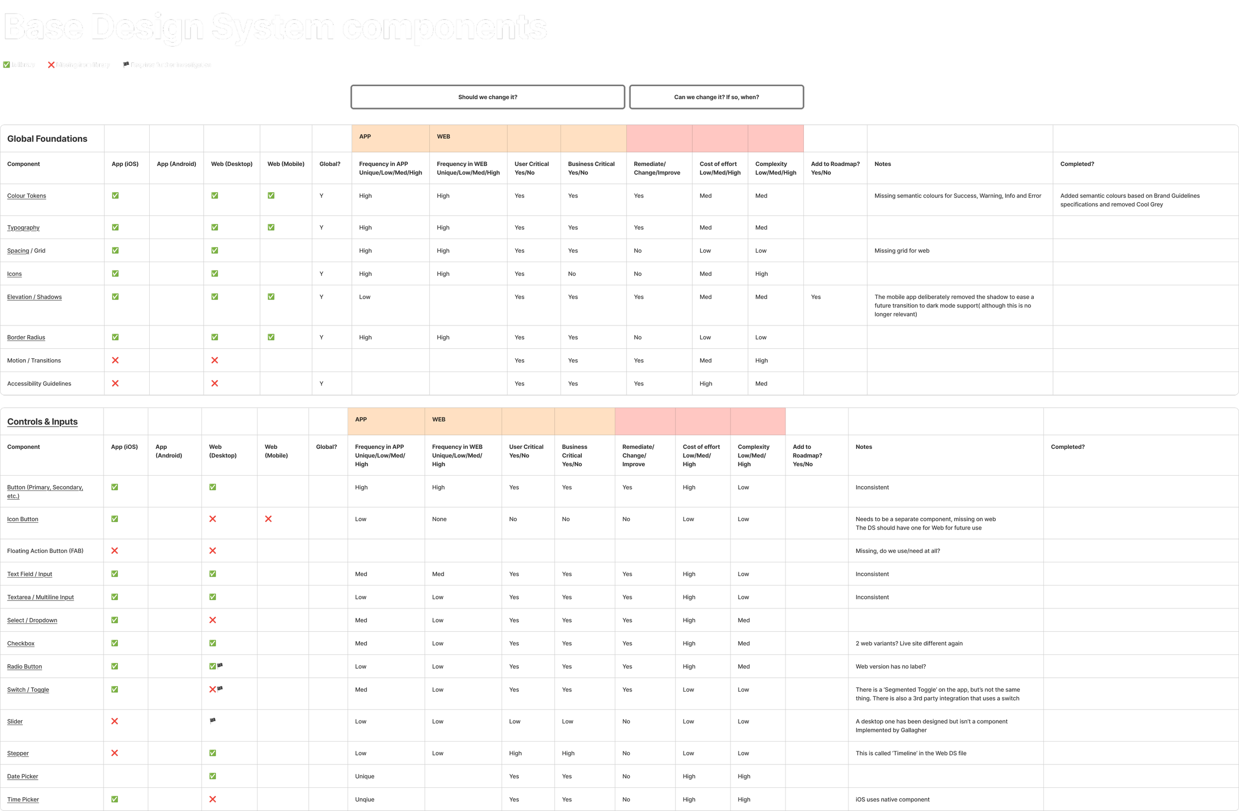
Full design system audit benchmarked against best practice requirements
The audit surfaced what I expected and some things I didn't. There was significant overlap between web and mobile components that were doing the same job but built differently, named differently, and maintained separately. There were near-duplicate variants that had drifted apart over time. And there were components that existed in one platform's file but not the other, with no clear reason why.
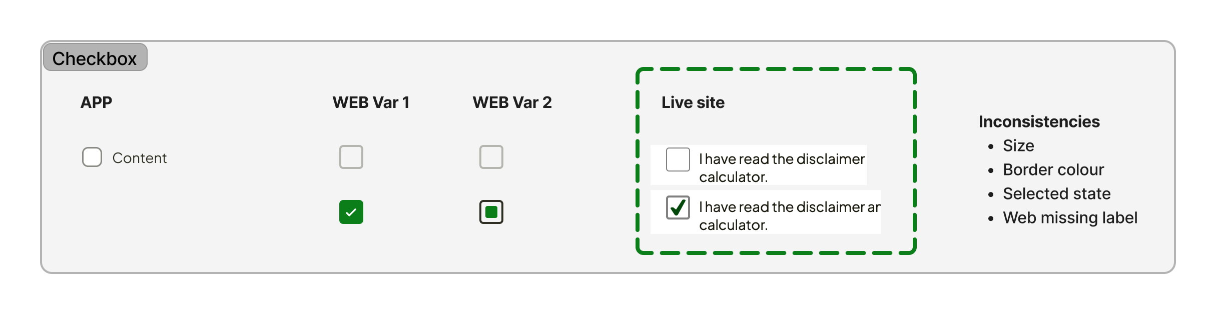
Visualising and documenting inconsistencies
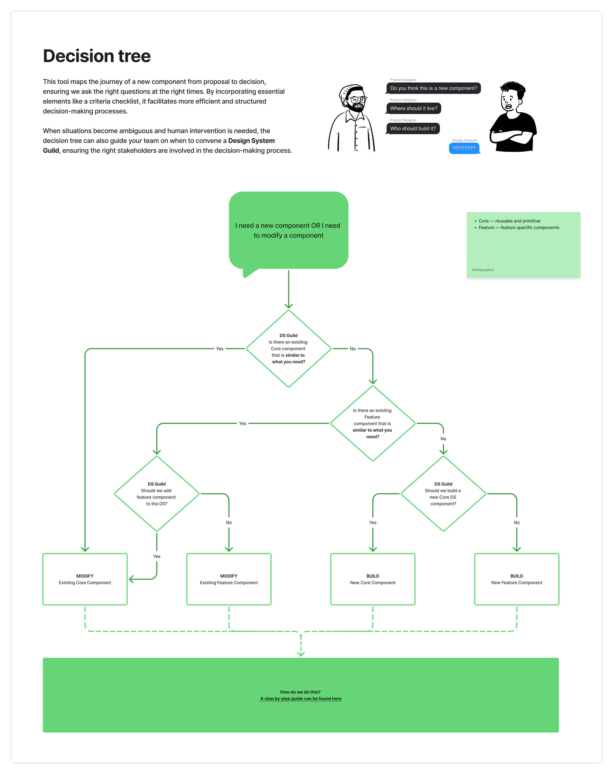
Drawing the line between shared and separate
One of the hardest decisions in any cross-platform system is knowing what should be unified and what should stay separate. Web and native mobile have genuinely different interaction models, different constraints, and different component needs. Forcing everything into a single shared structure would have created its own problems, components that tried to serve every context often serve none of them well.
I worked through the audit findings to draw a clear line. Foundations, colour, typography, spacing, iconography, could and should be shared. Structural components with close parallels across platforms were consolidated where the logic held. Components with meaningfully different behaviour on each platform were kept separate but brought into a consistent structure and naming convention so they felt like part of the same system rather than two different ones.
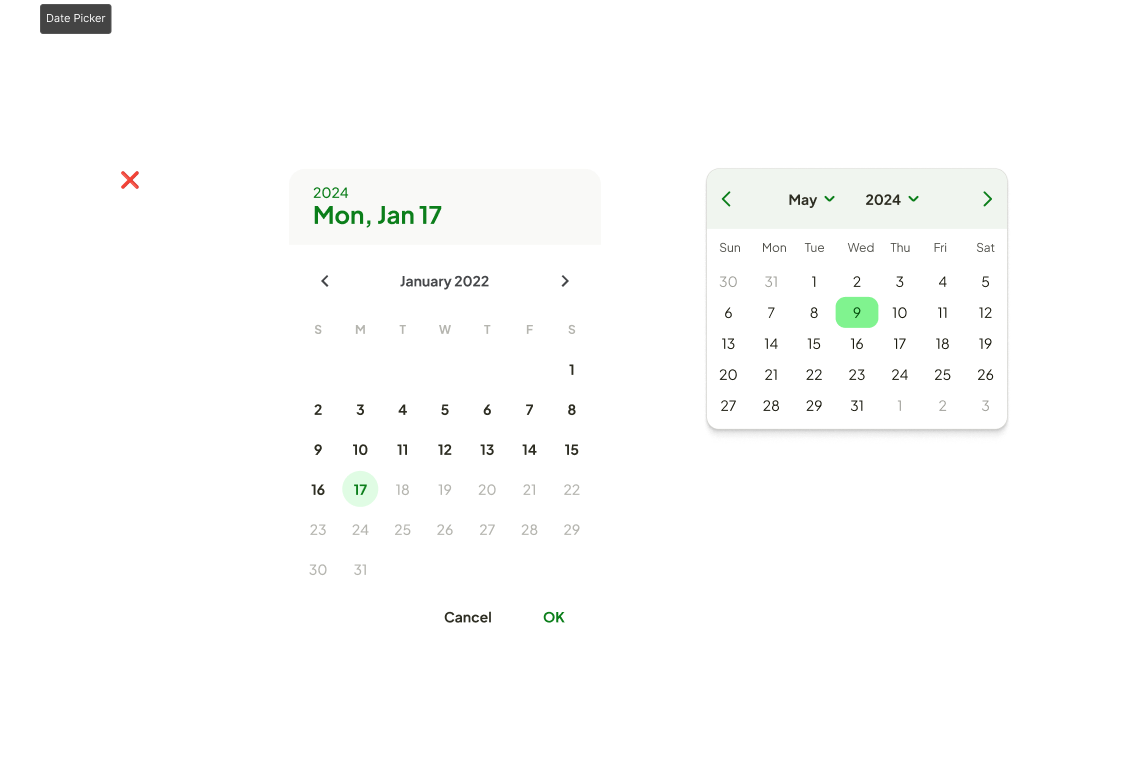
Visualising and documenting inconsistencies
Getting both designers on the same page
Reorganising a system that two people have been maintaining independently requires more than good Figma work. It requires alignment. Both designers had built up their own conventions and mental models, those weren't wrong, they just hadn't been made explicit or reconciled with each other. I worked with them directly through the consolidation process, making sure decisions were explained and agreed rather than imposed. The system they'd inherit had to make sense to them, not just on paper but in practice.
Defining what done looks like
Documentation is one of those things that's easy to de-prioritise because the value isn't immediately visible. I set a clear standard for what a documented component looked like, usage guidance, do and don't examples, variant descriptions, and notes on platform differences where relevant, and held the work to it consistently rather than letting documentation become an afterthought at the end.
Audit
Full catalogue of web and mobile components, variants, and patterns
Identify
Map overlap, duplication, and design debt across both platforms
Consolidate
Merge shared foundations, simplify divergent components, remove redundancy
Document
Structured usage guidance for every component, consistent across both platforms
Outcomes
Consolidation
Duplicated and overlapping components identified and resolved
Documentation
A fully documented system no longer dependent on two people's memory
Maintainability
Easier to update, manage and contribute to for the whole team
Structure
Web and mobile brought into a coherent, consistent shared system
Giving the team the right tools to contribute to the system
Skills and tools
Figma, System auditing, Design debt analysis, Component consolidation, Cross-platform systems, Documentation, Stakeholder alignment, Native mobile