A multi-brand design system for Teachers Health Fund
A single extensible design system built to serve Teachers Health Fund, Nurses Health Fund, and Uni Health, designed from the ground up to grow as new brands join the organisation.
The Challenge
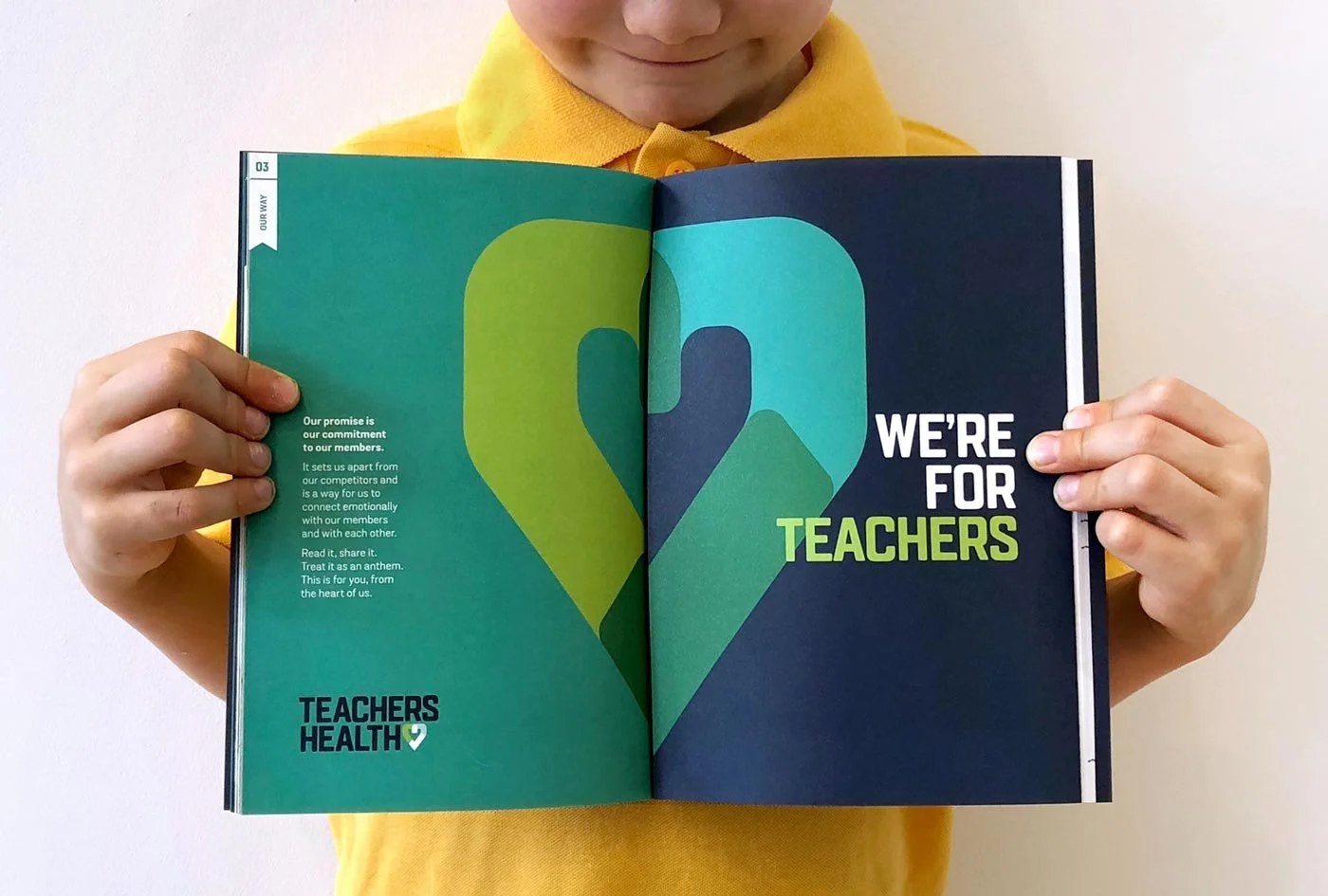
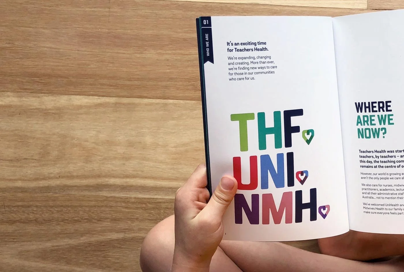
Teachers Health Fund, Nurses & Midwives Health Fund, and Uni Health are three sibling brands operating under the same parent organisation. Each serves a distinct professional community, teachers, nurses, and university staff and students each with its own identity, tone, and product surfaces spanning marketing websites, member portals, and internal tooling.
When I came on board, there was nothing shared between them. No common components, no unified design language, no system connecting any of it. The brief was to build one, but not just for today. The organisation needed a system that could absorb future brands without breaking, where onboarding a fourth brand was a matter of configuration, not reconstruction. That made the architecture a first-order design problem from day one.
My Approach
Choosing the right foundation
The choice of Untitled UI as the component foundation was deliberate and strategic. Developers were already working with Tailwind, and Untitled UI's token structure maps tightly onto Tailwind's design primitives. That alignment meant the gap between design and code would be narrow from day one, components defined in Figma would translate directly into the token language the development team was already using.
Rather than building something parallel to that existing technical direction, I leaned into it. The system was designed to feel like a natural extension of the development stack and not a design artefact developers had to interpret and re-implement on the other side of a handoff.
Designing the architecture
The core structural challenge was this: three brands that look and feel meaningfully different, all sharing the same underlying components. Get the layering wrong and you end up with either a rigid system that flattens brand identity, or a fragmented one where each brand drifts back into its own silo.
The system was built in three layers: a shared core of components and behaviour, a token layer where each brand expresses its own identity, and a brand-specific extension layer for anything genuinely unique to a particular product context.
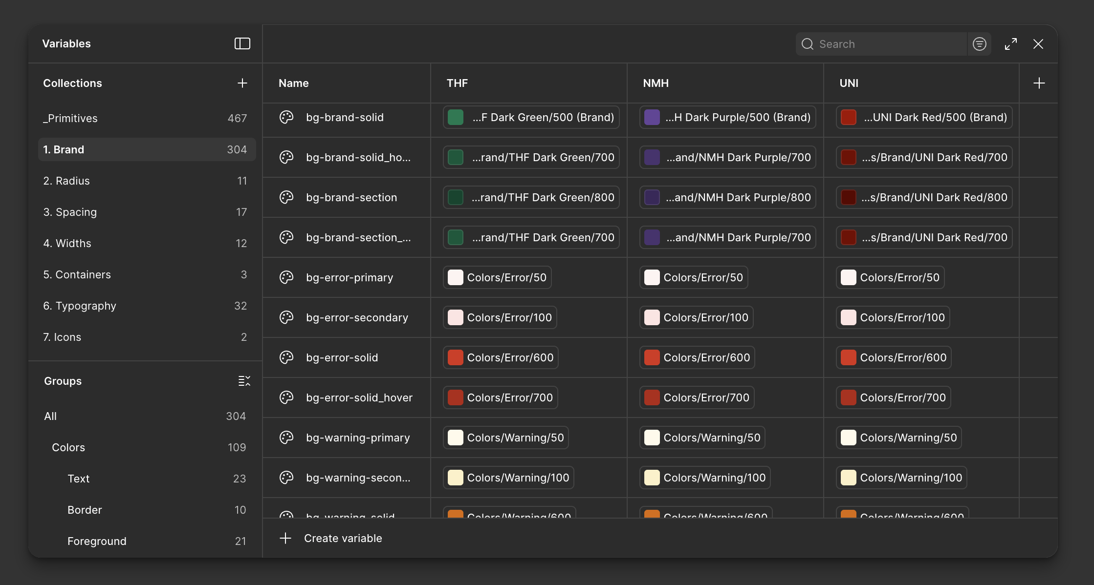
Using modes to define different brands
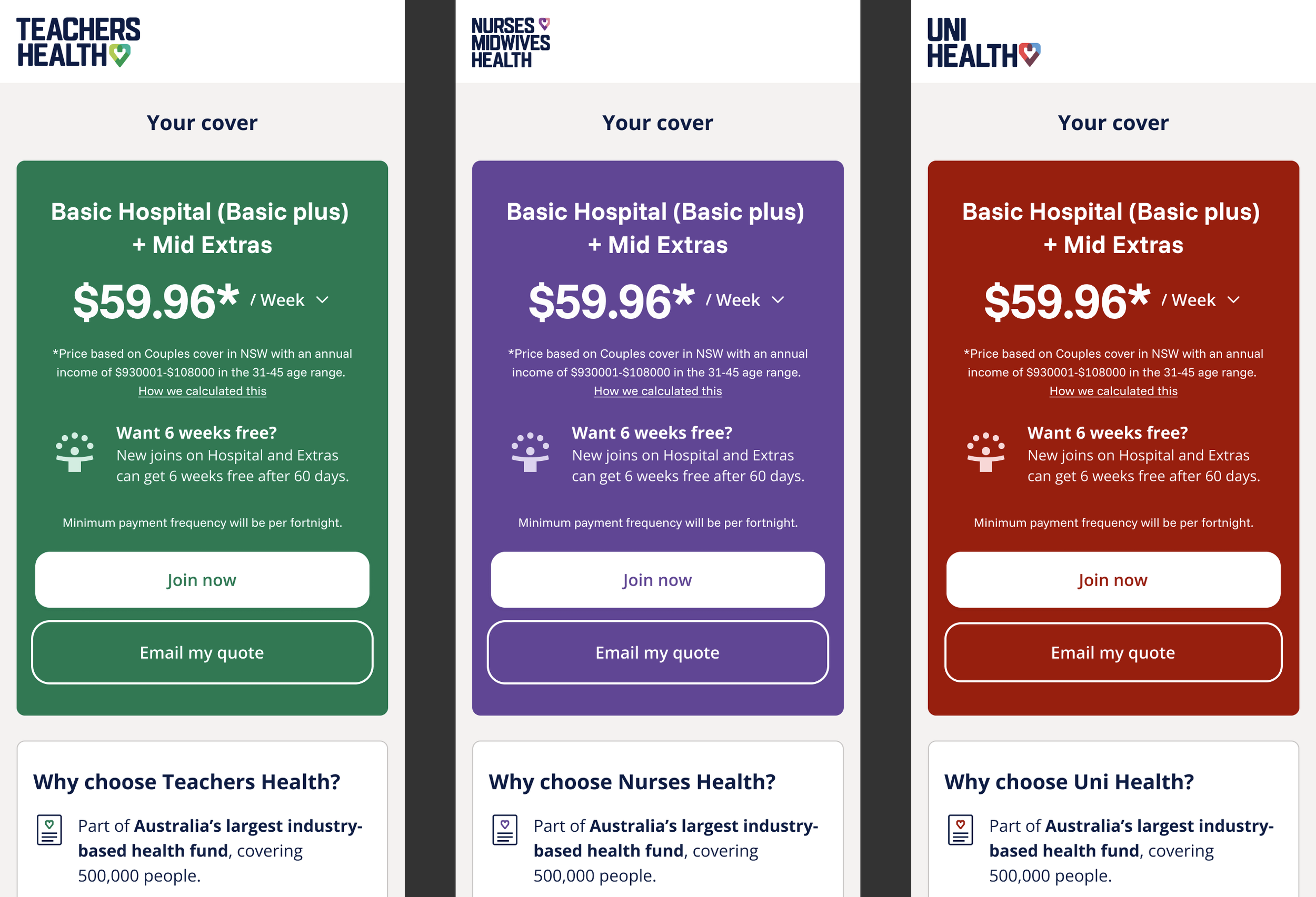
In Figma, this meant separating what was structural from what was expressive. Typography scales, spacing, border radii, colour roles, these lived at the core and were governed by tokens. Each brand then had its own token set that plugged into that core, changing how components looked without changing how they worked. A button stayed a button. Its colour, weight, and corner radius reflected whether it lived inside Teachers Health Fund, Nurses Health Fund, or Uni Health.
Building for brands that don't exist yet
Future extensibility wasn't an afterthought — it was a constraint I designed against from the start. Every decision about structure, naming, and token architecture was made with one question in mind: how easy is it to add a fourth brand to this? That meant strict token naming conventions, clear rules about what could be overridden at each layer, and documentation that made the system legible to designers and developers who hadn't been part of building it.
I led the team through establishing those conventions early, reviewing components against them as they were built, and making sure the system's rules were as clear as its components. The goal was a system that could be handed to someone new and extended without needing tribal knowledge to do it correctly.
It’s easy to switch brand with modes
Spanning every surface
The system had to hold up across a wide range of contexts — public-facing marketing sites, authenticated member portals, and internal tools used by staff. Each has different density requirements, different interaction patterns, and a different relationship to brand expression. Components were designed with that range in mind, tested across contexts rather than optimised for any single one.
Outcomes
Extensibility
New brands can be onboarded by adding a token set, not rebuilding the system.
Brand coverage
THF, NHF, and Uni Health served from a single maintained source of truth.
Consistency
Unified component behaviour across all surfaces and brand contexts.
Dev alignment
Token structure maps directly onto Tailwind, minimal translation overhead.
Skills and tools
Figma, Untitled UI, Tailwind tokens, Multi-brand architecture, Design tokens, Component systems, Team leadership, Design-dev alignment, System documentation